Graphite+StatsD 服务Metrics监控
Graphite
Graphite是一个database + 图形展示工具,我们可以将服务的各种指标数据发送给Graphite,Graphite的Web页面中会以曲线的形式展现这些数据,方便我们观察对比服务的运行状况。
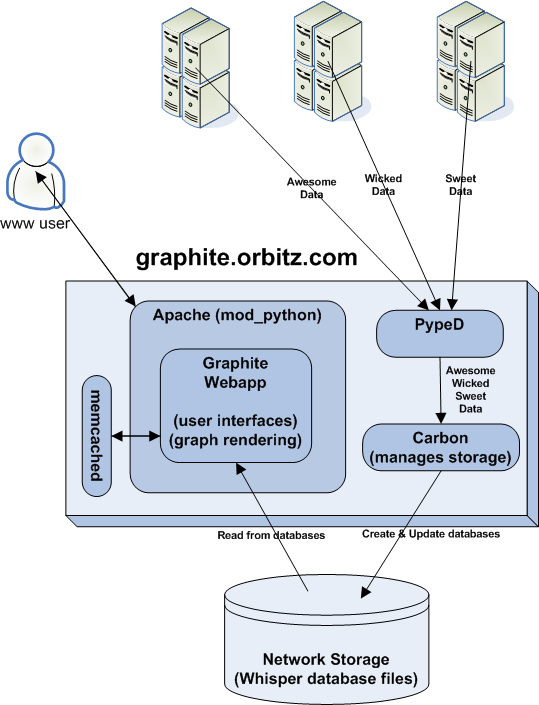
下面是Graphite的架构图:
如何Feed in数据
纯文本协议
Shell:
echo "local.random.diceroll 4 `date +%s`" | nc -q0 ${SERVER} ${PORT}
Python:
import socket
sock = socket.socket(socket.AF_INET, socket.AF_DGRAM)
sock.sendto('runtime.py.yq30.instances 200 1324567980', (ip, port))
数据Feed in地址:udp://metrics.sae.sina.com.cn:2006
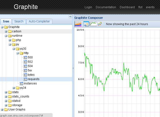
数据展示页面
数据展示页面:http://metrics.sae.sina.com.cn
Functions
grahpite中所有的曲线数据都是可以使用函数进行操作的
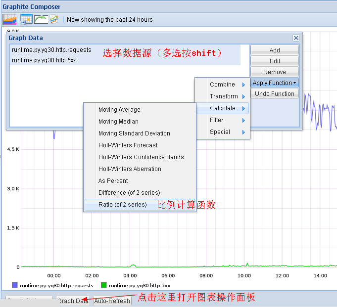
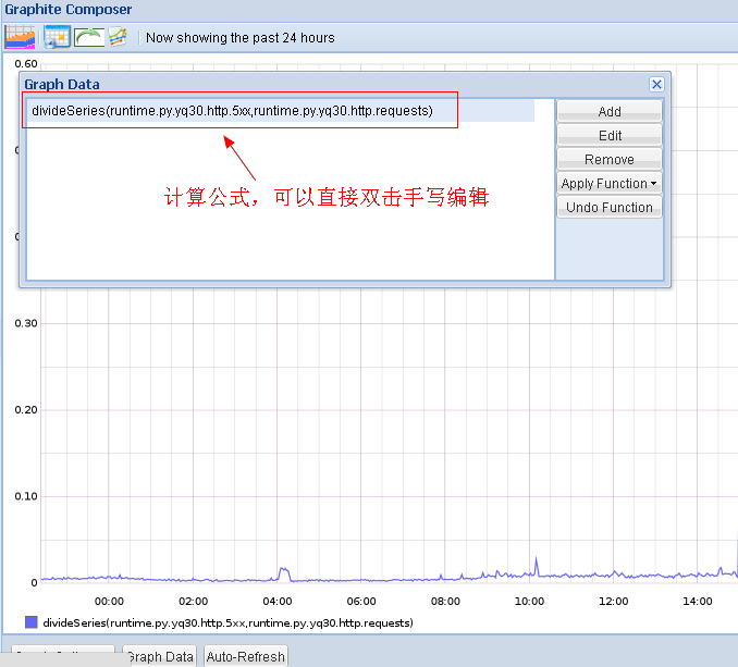
你也可以对这些生成的函数进行手工编辑:
Read more: http://graphite.readthedocs.org/en/1.0/functions.html
制作Dashboard
效果图:
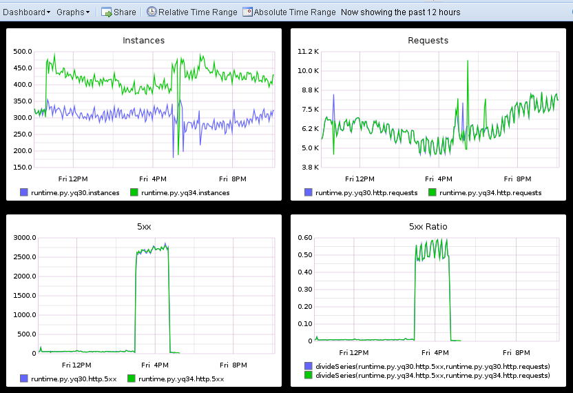
点击graphite页面页面右上角的Dashboard链接,进入Dashboard页面,你可以直接在上面的面板中选择需要的曲线加入到dashboard中,所有的曲线都可以拖曳编辑。
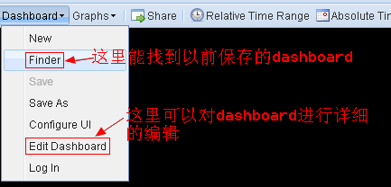
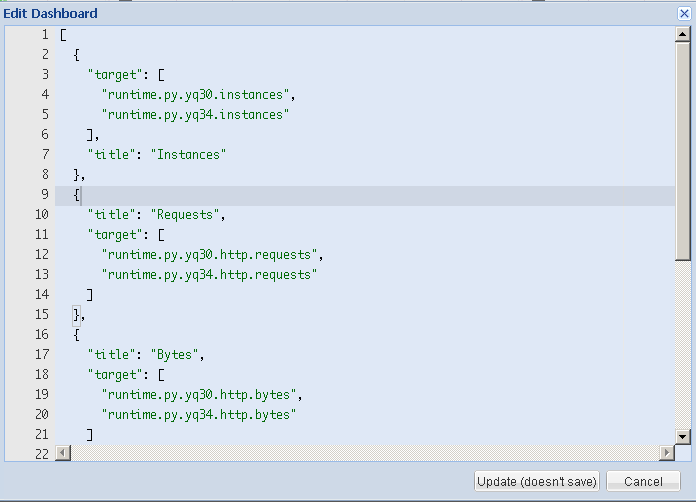
当然你也可以直接打开dashboard的edit页面,按照下面两图手工编辑曲线的生成参数(生成复杂曲线的时候很有用)。
[
  {
    "target": [
      "runtime.py.yq30.instances",
      "runtime.py.yq34.instances"
    ],
    "title": "Instances"
  },
  {
    "title": "5xx Ratio",
    "target": [
      "divideSeries(runtime.py.yq30.http.5xx,runtime.py.yq30.http.requests)",
      "divideSeries(runtime.py.yq34.http.5xx,runtime.py.yq34.http.requests)"
    ]
  }
]
这个json数组里的每一个元素定义了一张图,target定义了在图上要显示哪几条曲线,title是图的标题。
target可以是单个曲线,也可以是多个曲线使用function进行的变换后的曲线。比如上面的例子中,第二张图就展示了yq30和yq34两台机器上的http 5xx出现比例的曲线(5xx出现的次数除上总请求数)。